Designing KPI Dashboards with AI: What to Measure and Why
Learn how to design AI-enhanced KPI dashboards that drive decisions, not just display data. Practical advice for UK businesses.
Ross Miles30 January 20267 min read
Learn how to design AI-enhanced KPI dashboards that drive decisions, not just display data. Practical advice for UK businesses.
The average KPI dashboard is a cemetery of good intentions. Somebody spent weeks building it, the leadership team looked at it enthusiastically for a month, and now it sits in a browser tab that nobody refreshes. We know this because we have inherited dozens of these abandoned dashboards from businesses that came to us wanting "better analytics."
The dashboard was never the problem. The problem was that it measured the wrong things, presented them without context, and required human interpretation that nobody had time for. AI changes all three of these failure modes — but only if you design the dashboard correctly from the start.
Before talking about what works, it is worth understanding why the standard approach fails. There are three consistent patterns.
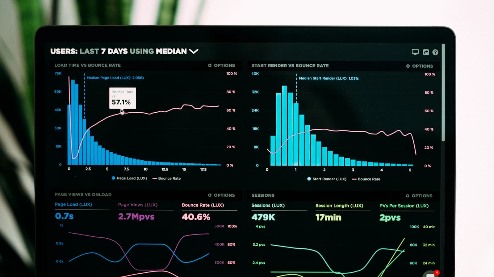
Too many metrics. A dashboard with 40 KPIs is not a dashboard — it is a data dump. When everything is a priority, nothing is. The human brain can monitor 5-8 metrics effectively. Beyond that, attention diffuses and the dashboard becomes visual noise. The temptation to add "just one more metric" is the single biggest design failure we see.
No context or benchmarks. A revenue number of £127,000 is meaningless without context. Is that good? Bad? Normal? Compared to what? A KPI without a benchmark, trend line, or target is just a number on a screen. It does not tell you whether to celebrate, worry, or investigate.
Static presentation. Traditional dashboards show you the same view regardless of what is happening in the data. Whether everything is on track or the business is on fire, the dashboard looks the same. This means that spotting problems requires active monitoring — someone has to look at the dashboard and recognise that something has changed. In practice, problems get spotted when they become impossible to ignore, not when early intervention would have been effective.
AI-enhanced dashboards solve all three problems.
We use a framework we call the "Five-KPI Rule" for every dashboard we build. At any given level of the business — company-wide, departmental, or team — there should be exactly five primary KPIs. Five is enough to cover the key dimensions of performance. It is few enough that each one gets genuine attention.
For a typical UK eCommerce business, the company-level five might be:
Revenue vs. Forecast — Not just actual revenue, but how it compares to the AI-generated rolling forecast. Green means on track, amber means within the confidence interval but trending low, red means outside the expected range.
Contribution Margin — Revenue minus direct costs (COGS, marketing spend, fulfilment). This is the metric that actually matters for business health, yet most dashboards show gross revenue instead.
Customer Acquisition Efficiency — Revenue generated per pound of marketing spend, segmented by channel quality. Not ROAS (which ignores margin), but actual contribution per acquisition pound.
Customer Retention Rate — The percentage of last period's customers who purchased again this period. For subscription businesses, this is obvious. For eCommerce, it is equally important but often unmeasured.
Cash Runway — Based on current burn rate, known commitments, and forecast revenue, how many months of cash does the business have? This is the metric that ensures the other four remain relevant.
Each KPI has three layers: the current value, a trend sparkline showing direction, and an AI-generated context note explaining what is driving the current state.
Adding AI to a KPI dashboard is not about making it flashier. It is about making it smarter in three specific ways.
Intelligent Alerting. Instead of static thresholds ("alert me when revenue drops below £100K"), AI learns the normal variance patterns for each metric and alerts on statistically significant deviations. Revenue dropping 5% in January is normal seasonal behaviour and does not warrant an alert. Revenue dropping 5% in June is unusual and warrants investigation. The AI knows the difference because it has learned your business's patterns.
We implement this through automated anomaly detection that runs against your data warehouse every morning. Alerts are delivered via email or Slack before the workday starts, so the leadership team walks in knowing what needs attention.
Diagnostic Drill-down. When a KPI deviates from expectations, the natural question is "why?" AI pre-computes the most likely explanations. If revenue is below forecast, the dashboard can tell you: "Revenue shortfall is concentrated in Category B, which is experiencing a 23% decline in conversion rate since Tuesday. The decline correlates with a Google Ads quality score drop on three high-volume keywords." This diagnostic analysis runs automatically — no analyst required.
Predictive Context. Each KPI is accompanied by a short-range forecast: "Based on current trends, monthly revenue is on track to finish at £142K (versus £150K target). The gap is narrowing — the last 5 days have outperformed the previous 10." This gives decision-makers not just a snapshot but a trajectory, enabling proactive rather than reactive management.
The most important design principle for any KPI dashboard is this: every metric should map to a specific decision or action. If you cannot answer "what would I do differently if this number changed?" then the metric does not belong on the dashboard.
We apply this test rigorously during our dashboard design process. For each proposed KPI, we ask three questions:
This process typically reduces an initial list of 30-50 proposed metrics down to 5-8 per dashboard. The remaining metrics are not discarded — they become drill-down details accessible when a primary KPI triggers investigation.
Our standard KPI dashboard stack for UK SMEs is deliberately simple and cost-effective:
Data Layer: BigQuery as the central warehouse, with daily automated ingestion from all business systems. Cost: £20-80 per month.
AI Layer: Google Cloud Functions running anomaly detection, diagnostic analysis, and forecast generation. These run on schedule (typically daily at 6am) and write results back to BigQuery. Cost: £10-30 per month.
Presentation Layer: Looker Studio for the dashboard itself. It connects directly to BigQuery, updates automatically, and costs nothing. For businesses that want more sophisticated interactivity, we build custom dashboards using React — but Looker Studio handles 80% of use cases adequately.
Alerting Layer: Automated emails or Slack messages delivered by Cloud Functions when anomalies are detected. This ensures the dashboard does not depend on someone remembering to check it.
The total ongoing infrastructure cost is typically £30-110 per month. The implementation through our Mind Build programme is a one-time investment that includes the data pipeline, AI models, dashboard design, and alerting configuration.
The ultimate measure of a KPI dashboard is not how good it looks but how often it changes a decision. After six months, if your leadership team cannot point to specific decisions that were made differently because of dashboard insights, the dashboard has failed.
We track dashboard adoption through usage analytics: how often is it viewed, by whom, and which drill-downs are most frequently accessed. This data informs iterative improvements — adding metrics that prove useful, removing ones that get ignored, and refining alerts to reduce noise.
If your current dashboards are unused, overcrowded, or disconnected from decisions, the solution is not a better tool — it is a better design process. Our Mind Map assessment includes a decision audit that identifies exactly what your team needs to see, how often, and in what context. From that foundation, we design dashboards that become genuinely indispensable.
If measuring and acting on business performance is important to you — and it should be — let us design a KPI system that actually gets used.

Ross Miles
Head of Operations & AI Systems
Turns complex AI requirements into reliable production systems.
How UK SMEs can use Google BigQuery for powerful business analytics at a fraction of the cost of traditional BI platforms.

A practical guide to implementing predictive analytics for UK SMEs. No PhD required — just good data and clear business questions.

Use AI-powered customer analytics to identify, understand, and retain your most valuable customers. Practical eCommerce strategies.
Book a free 30-minute discovery call. We'll discuss your business, identify quick wins, and outline how AI can drive real ROI.
Get Started